Background
This Caesar Shift utility started first as me trying to build an Enigma machine in a sort of Saul Bass/Spy vs Spy visual style. Turns out, that's rather difficult when you not only don’t know how an Enigma machine works but you also have to mimic a designer's unique style that with not a ton of precedent in digital design.
I started by making a handful of visual boards on Dribbble and Are.na, the latter of which is a lovely service if you're unfamiliar. I also began my research on Enigma machines, which began and ended with this one video, before attempting some rough wireframe concepts of what an Enigma simulator could look and act like. I used Figma for all of this project's design.
Day 1
The first concept was around the plugboard of the Enigma machine (at this point you should have at least skimmed that video I referenced). It was, charitably, a fucking train-wreck. If I had gone this route, I think the only redeeming quality this would've had would've been some wiggly noodle cable physics from that D3 link I pasted in the Figma page.
A slight variation on this Quartz Composer-inspired plugboard design came with the sliding plugboard. In this, the top and bottom rows would be detached and would scroll freely so you could make arbitrary connections. It solved the rat's nest of cables, except not really. This would've just kicked the can down the road, I still had to figure out a way to show that there's a connection offscreen if you've got, say, A and N connected but one of those letters wasn't visible in the scrolled-to region.
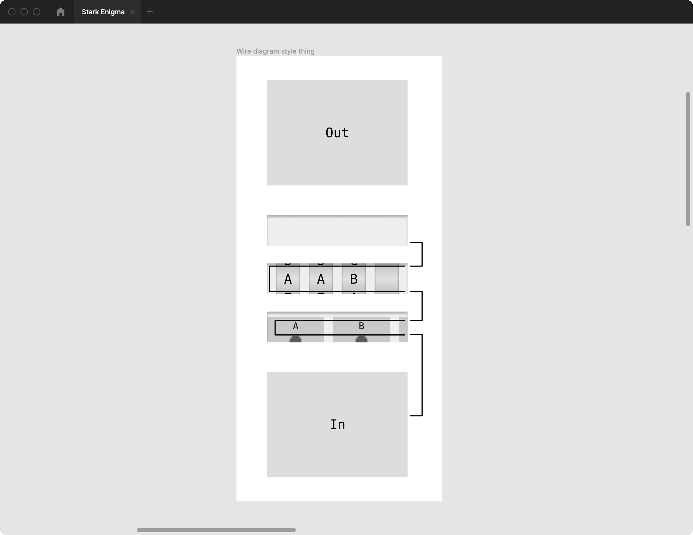
At this point, I put a pin in the plugboard problem for later because I remembered there's more to an Enigma machine than the plugs. Behold, the very first concept in which I attempted to lay out the machine on a scrolling 2D plane:
I don't even know what I was going for here. Basically from the bottom to the top (notoriously the way people navigate websites 🙄), you've got the input, a scrolling plugboard, the rotors with a loopback, and the read-only output. This is bad and has no redeeming qualities. Moving on.
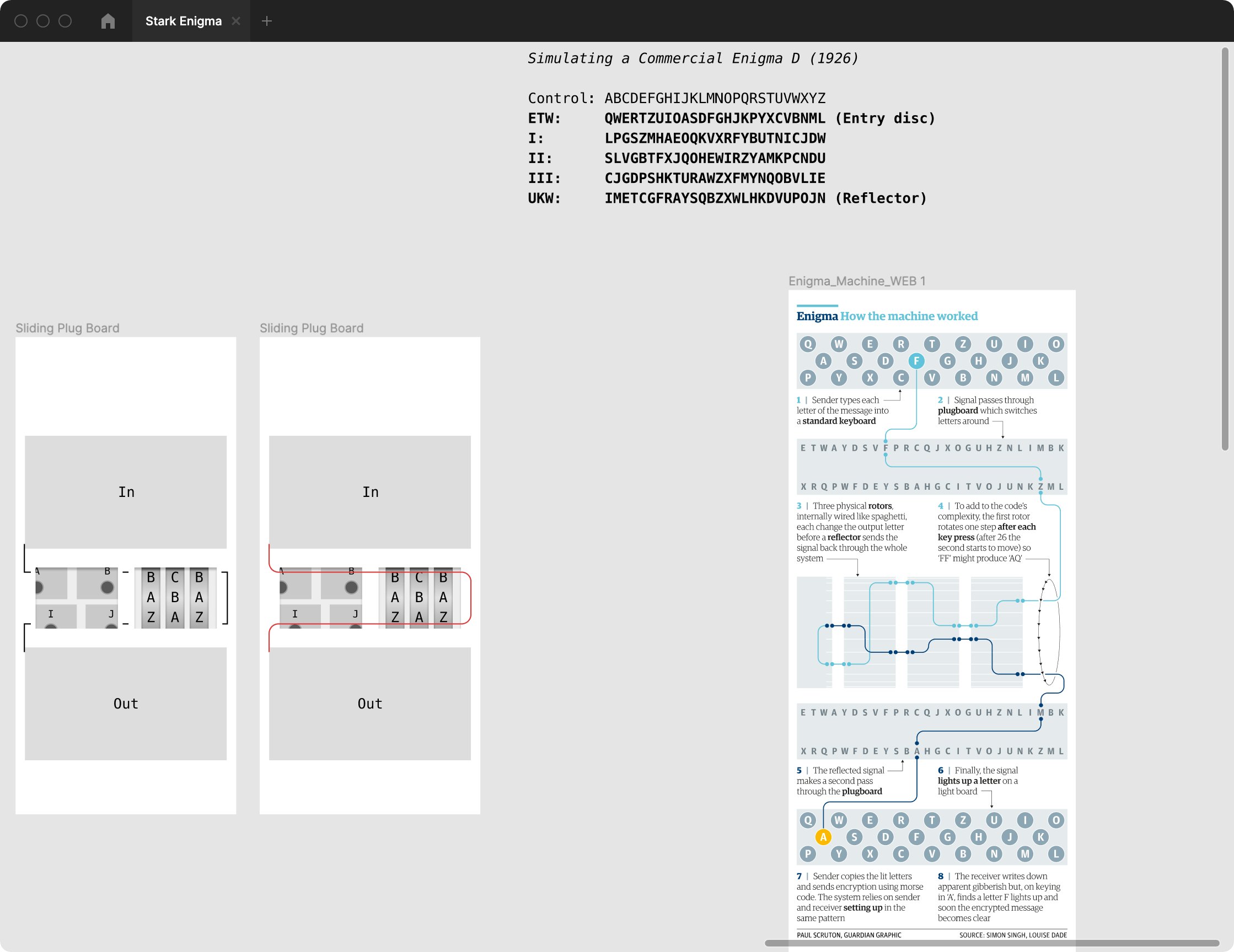
Knowing that a layout with THAT many wires and what a stupid problem doing virtual cable management would be, I started on a version that used the actual Enigma machine's path of electricity, going from the input, through the plugboard and back again, to the rotors with a loopback, then to...I'm not sure, actually.
Note the inner shadows here. At this point, the plan was to have each section start collapsed and you could tap each box to expand it along with an explainer on that particular piece (e.g. "These are the rotors and it blah blah blah. Try rotating the first one 3 positions down"). I think the takeaway here is that I cannot, for the life of me, estimate how long stuff will take and I create way more work for myself than needed.

Started designing a tablet layout. Accidentally made a penis. Bon appétit (sfw).
The problem I kept running into here, aside from it still being sorta phallic, is that I was running in circles. I was getting slightly irked at how little progress I was making on this silly weekend project. I started mapping out how the rotors should work, I was redrawing a mechanical flowchart thing, nothing seemed quite right. So I make the decision to dumb it down and begin doing the fun part of visual design.
This is the closest I've ever gotten to feeling good about a design on this project. All I had to do was get rid of absolutely everything. I scrapped the idea of reflecting data back through a separate track before going to the output. I removed even more detail when I got to adding back the various components.
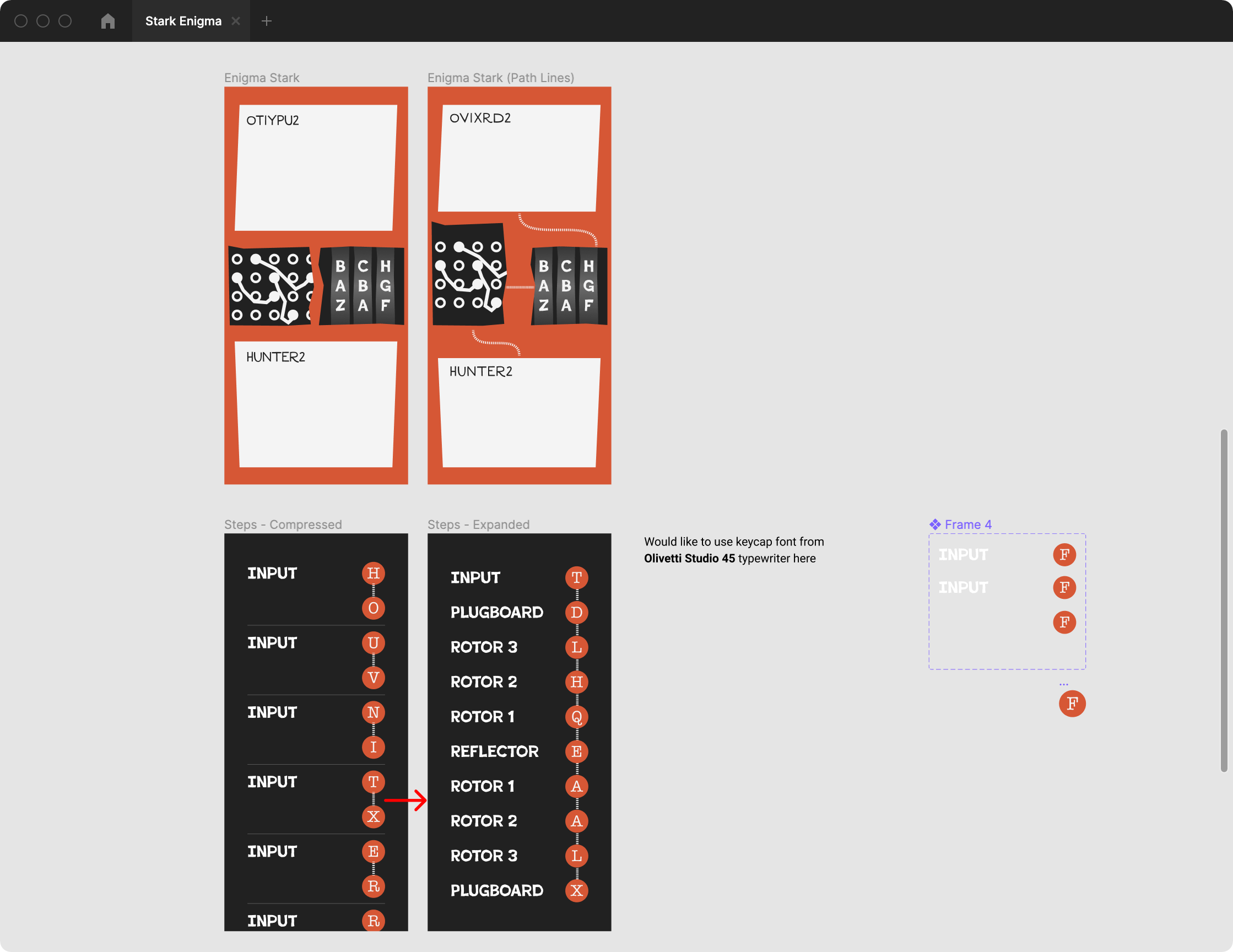
After refining the wiring even more to just a single track with no loopbacks, I felt like it was in a good place. For good measure, I added an additional view of the different steps the message went through to get the encoded output. As an aside, information on typewriter keycap fonts are surprisingly sparse. Tons of blogs dedicated to the actual monospaced typefaces in various 20th century typewriters but almost nothing about the keycap fonts. The steps would act like a subway map, each letter could be expanded for the "stops" it took on its journey through the machine.
Day 2
Clarity strikes and I have no motivation to build an entire Enigma machine simulator, so I scale back the project to a simpler message encoder that offsets the message by any arbitrary number of positions, or a Caesar Shift encryptor. The most popular type of Caesar Shift is ROT-13, which rotates the input message by 13 spots ("XYZABC" becomes "KLMNOP").
I already had a rough mockup of the layout in my head, so it was just a matter of designing and building it.
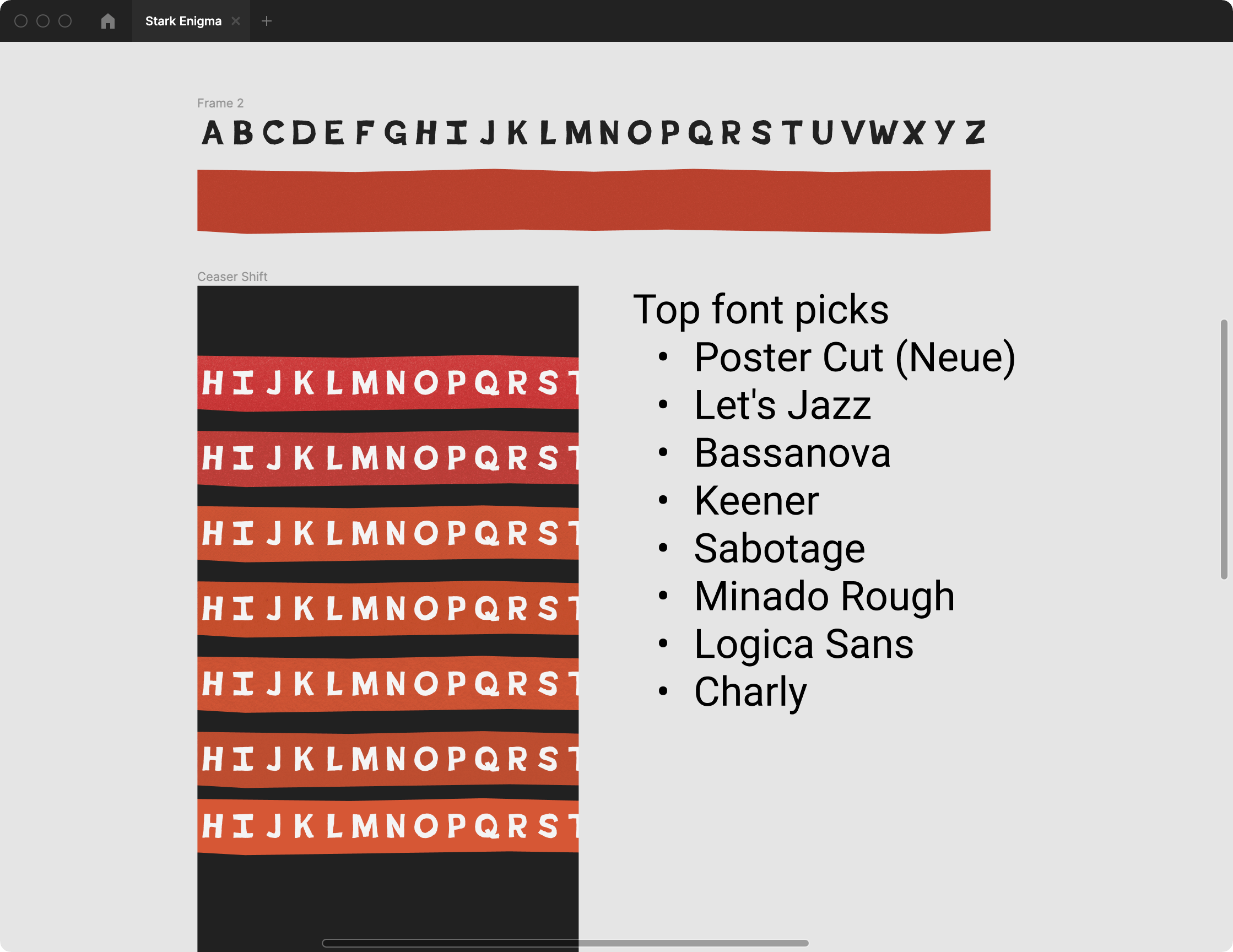
A hand-paper-cut font was imperative in nailing the art style I was going for. I used another Are.na channel to compare all the candidates I had in mind. Ultimately, Poster Cut by Adam Ladd prevailed as the best for the job.
After messing around with various red construction paper textures, I began building out the actual web app using Svelte, which I've found more fun than React while staying (somewhat) lightweight. I've written far too many words at this point so I won't go into too much depth about the actual development process. You can find the source code here if you're interested.
I will, however, point out a few things I'm proud of in the final product:
- How the output changes as you scroll, not just when you pause
- Using an SVG on the red ribbon let me do a paper-cut effect on the edges so when you swipe through, the jagged edges jitter around a little bit.
- Since the input/output
<textarea>elements are static, I could afford to use a polygonal CSSclip-pathon them. - I had no idea there was a
caret-colorCSS property, so I set that as the red accent color. - There's a really faint letterpress effect on the
<textarea>elements. The background uses a cotton paper texture and text has a faint drop shadow that goes straight up to give it a debossed look.
In summation and in short
If you're going to attempt an Enigma machine explainer website, might I suggest not doing that? It's a tremendous pain in the ass.